
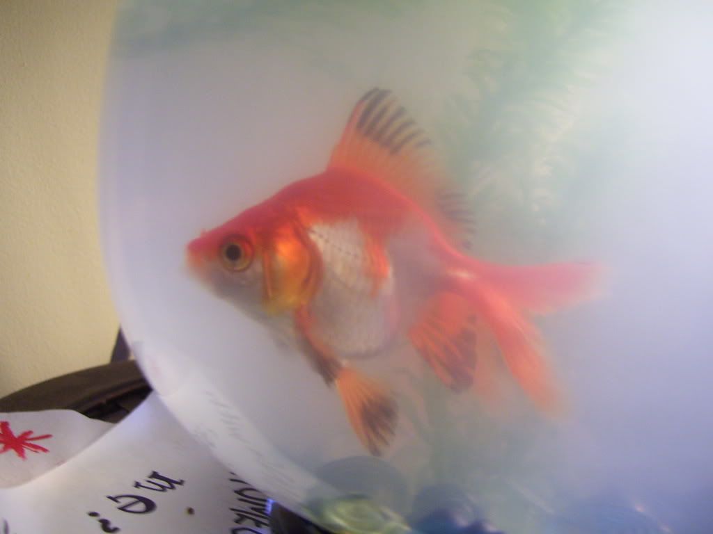
 Higher Res (and proper format)
We call this project (Computer Graphics II's most infamous) the "Font Design project" because, if you can tell, everything in this image is made of letters.
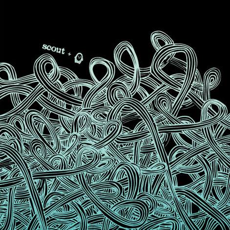
Our examples are absolutely beautiful...I remember last year I had one (that ended up going to Fine Arts Festival) hanging over my computer, and Christine and I would stare at it and play look-for-the-letter when we were at a loss for ideas in class. They tended to be designs like this or this or this but made of letters (and not henna on immodest ladies, either). There were countless other kinds, but Google Images isn't being very helpful (and searching "[various word] design") is proving to be VERY addicting and "oooooh lets go follow this link instead of being productive".
Regardless, I went this way with the project because!
- Cursive is way easier than print on this project (it connects very artistically)...yet the spindly cursive works better for the designs like the second example
- I fail at abstractism and this is the closest I could get...I like my rough drafts, and this kind of organic create-as-you-go project doesn't really like those
- I like colors (as you can undoubtedly tell)
When we first started, Gehl went around as he does and really liked mine because "it's like six designs instead of just one" and something else and something else that he couldn't seem to put into words that ended up as "no one's EVER done ANYTHING for this project like THIS! :DDDD". So...that's pretty cool. :) I like being apparently creative. It's almost as good as when I get that artistic rush that makes me dance in my seat.
The worst part was trying to get the drops looking fluid. I'm not sure how I could have done much better though, so I'm cool with it.
And when I was done with the flat layers, I wanted to add something. I decided it was missing a shadow, so I spent a period and a half figuring out a way to grab each drop as one layer (I was working in Adobe Illustrator, which is very different and certainly not my favorite program) and add a drop shadow. Eventually, I ended up liking it with each letter given a drop shadow, which took me about five, ten minutes tops. C'est la vie....
To wrap it up, this put me in a much better mood than Justice League Crosses the Delaware EVER had. And I'm even on better terms with Illustrator...Christine can attest that Illustrator is not my friend.
"ABC can be found by Jackson 5"


